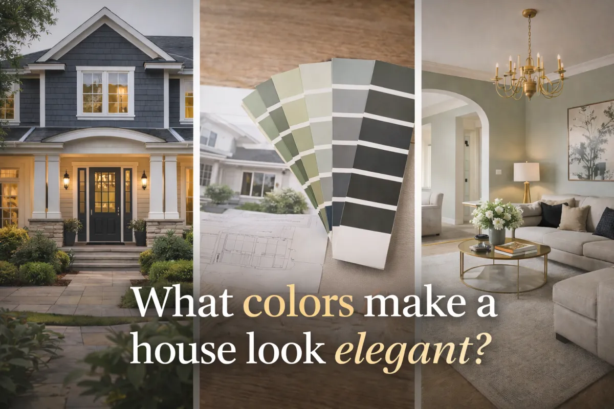
What Colors make a house look Elegant?

WHAT COLORS MAKE A HOUSE LOOK ELEGANT?
It's not about how much you spend, but about knowing how to choose.
When we think of an elegant house, many people imagine large budgets, expensive materials, or complete renovations.

The reality is different: elegance isn't bought, it's designed.
And one of the most important and most underestimated, factors is the right color choice.
In 2026, trends confirm something that designers have known for years:
Well-chosen colors can elevate any space, even with moderate budgets.
2026 Color Trends:
Modern Sobriety and Timeless Warmth
This year, the leading colors don't shout, they whisper sophistication. Tones that provide calm, depth, and visual balance predominate.
Trending base colors:

Warm whites (ivory, off-white, alabaster)
Soft grays with beige undertones
Greige (perfect blend of gray and beige)
Sand, linen, and stone tones
Muted greens (olive, sage, eucalyptus)
Deep but soft blues (slate blue, dusty navy)
These tones work because:

They reflect light better
They are not visually tiring
They combine with classic and modern styles
They age well over time
Elegance in Facades:
Balance Before Extreme Contrast.
An elegant facade doesn't need many colors.
In fact, the most sophisticated combinations usually use only 2 or 3 well-chosen tones.
Winning combinations for exteriors:
Greige ➕ warm white trim ➕ matte black accents
Off-white ➕ dark gray or olive green doors
Sand tone ➕ brushed steel details
Light gray ➕ deep blue shutters


💡 Key Tip:
The secret is in the balance:
Neither all light without character, nor overly aggressive contrasts.
Elegance in Interiors:
Less Impact, More Coherence. In interiors, elegance is perceived when spaces flow visually.
Ideal Colors for Interiors 2026:

Warm light grays for common areas
Soft whites in hallways and ceilings
Soft greens or muted blues for accents
Continuous neutral tones between rooms
💡 Key Tip:
A house looks more elegant when the colors don't compete with each other, but rather complement each other.
")
The Power of Accents:
Where Sophistication Lives.
This is where many homes make the leap from "pretty" to elegant.

The right accents elevate any base color:
Accents that always work:
Matte black ➡ modern, defined, timeless
Ideal for doors, railings, hardware, light fixtures.
Brushed steel ➡ clean, understated, contemporary
Perfect for kitchens, bathrooms, and functional details.
Antique gold / aged brass ➡ warmth and character
Adds elegance without looking ostentatious.
💡 Key Tip:
The key is to use them intentionally, not excessively.
Timeless Elegance:
The True Goal.
The most elegant homes don't follow extreme trends.

They follow principles:
Well-thought-out neutral palettes
Consistent accents throughout the house
Smooth transitions between spaces
Colors that look good today ➡ and in 10 years
Choosing well today avoids:
Repainting prematurely
Aesthetic regrets
Spaces that look "out of style"
🎯 Conclusion:
Choosing well always costs less than correcting mistakes.
You don't need to spend more to make your house look elegant.
You need to make informed decisions.
A GOOD COLOR:

Increases the perceived value of the house
Improves natural lighting
Makes spaces feel larger and more harmonious
Adds character without losing sophistication
In our daily work as a painting company ➡ VENPRO PAINTING, we see how the right choice of color and finishes can completely transform a space, without renovations or major investments.
That's why, in addition to painting, we help our clients choose balanced, timeless, and well-thought-out combinations, for both interiors and facades.
Our goal is not just to apply paint, but to achieve a result that looks great today and continues to perform well over time.
If you have a project in mind and want to make sure you choose wisely from the start, we would be happy to help you evaluate it and guide you.
👇 Request Your Free Estimate Here:
